Rehearsing Philadelphia
2021—2022
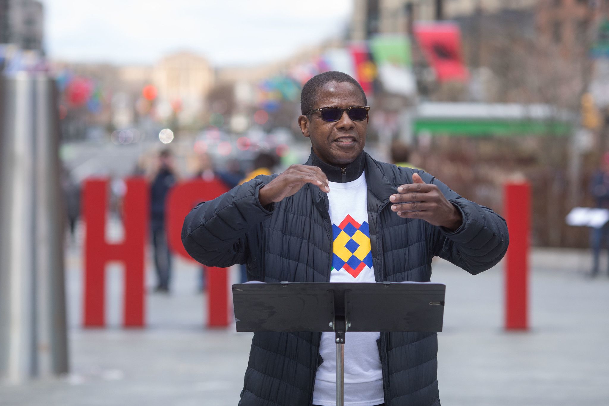
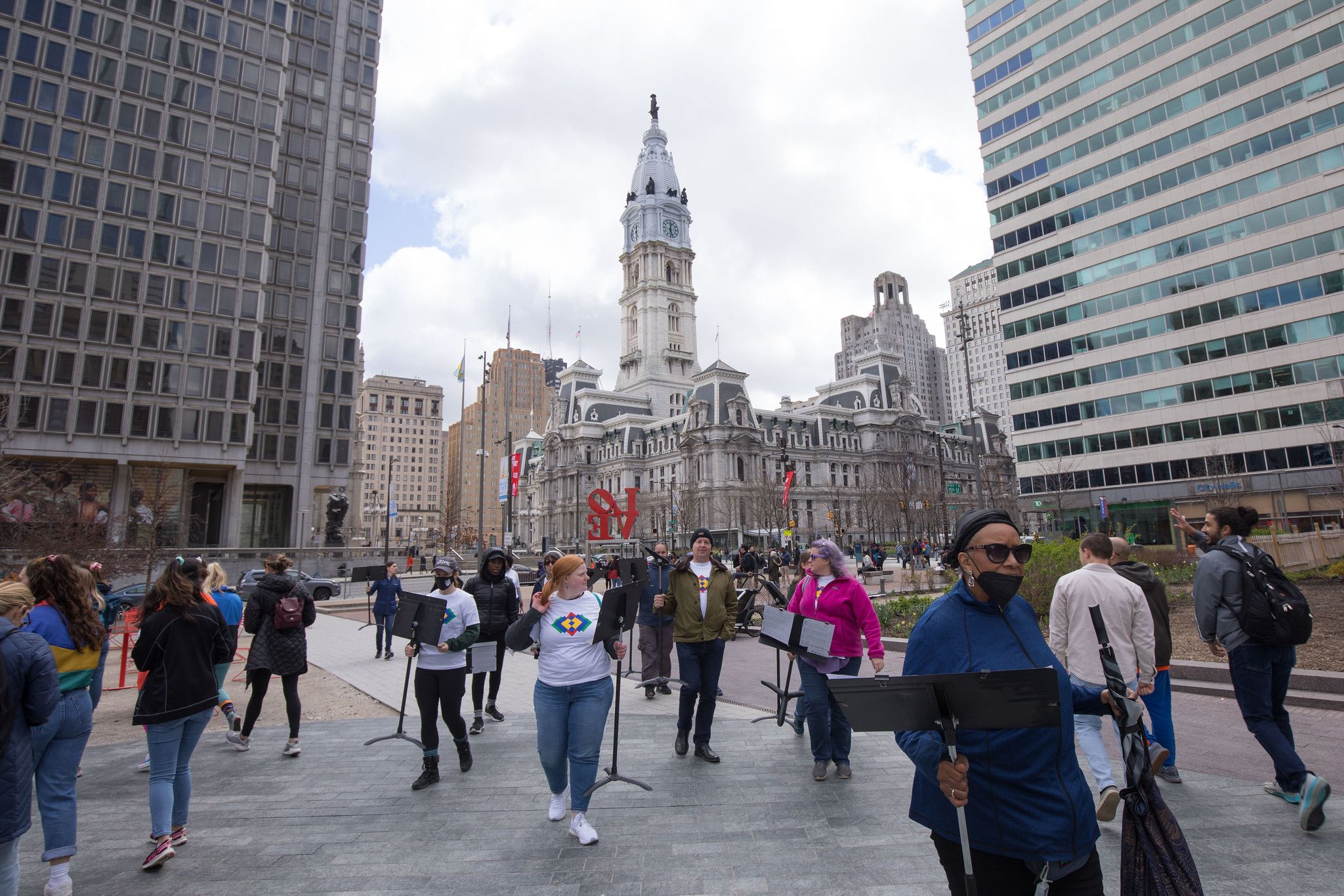
“Created by Ari Benjamin Meyers and jointly produced and presented by the Curtis Institute of Music and Drexel University’s Westphal College of Media Arts & Design, this large-scale public project explores how we can come together as a city through musical rehearsal. The traditional musical preparation process focuses on rehearsing as a way to attain perfection, which is then repeated in performance. This is not how we live modern life in a rapidly changing world of social upheaval. The future will be rehearsed, not perfected. Rehearsing Philadelphia re-examines the rehearsal processes which allow people to act together and be empowered to create new realities.” — Rehearsing Philadelphia


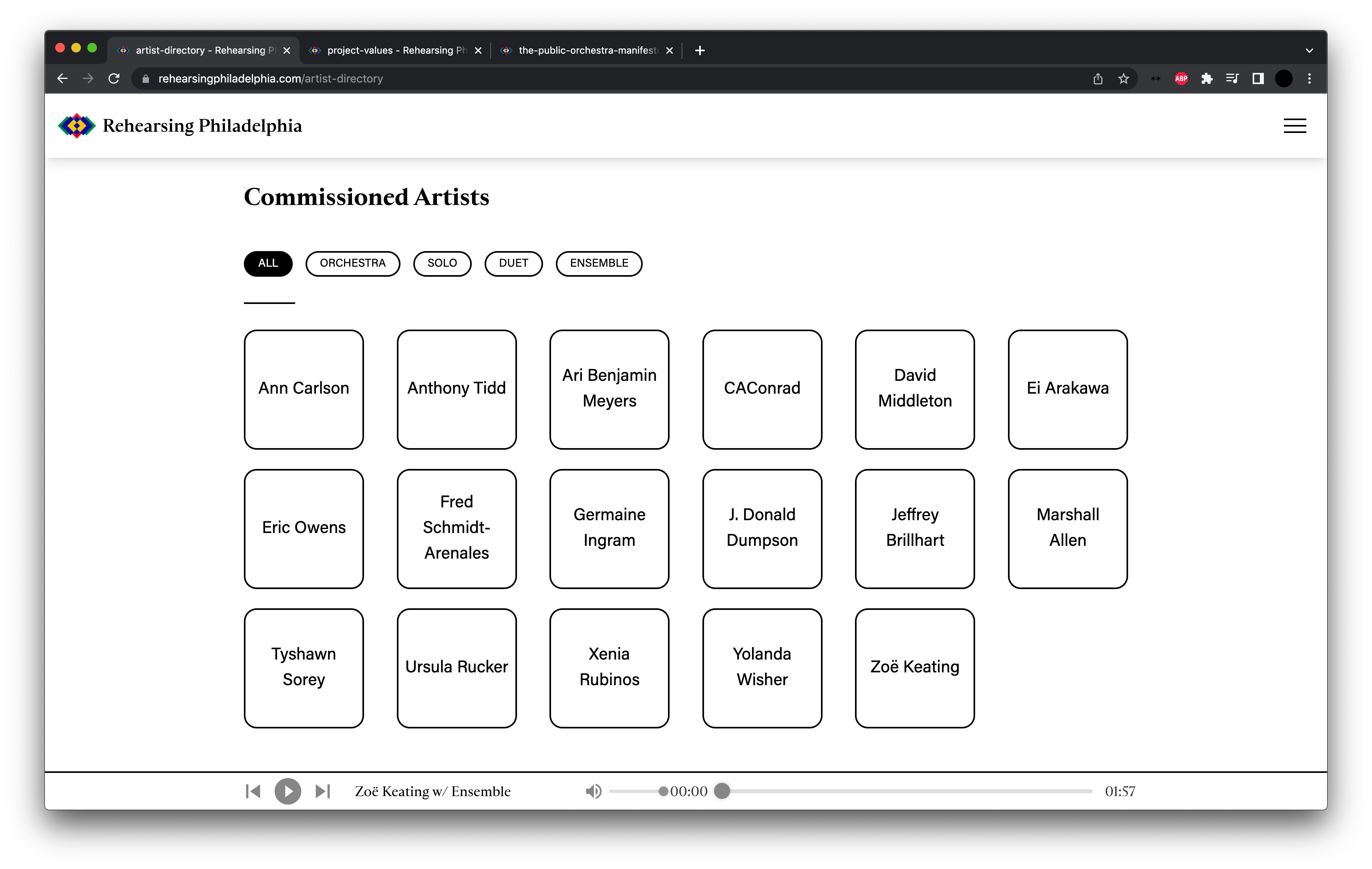
I was brought on to to build the brand system for the project, which was then handed off to ALLEN & GERRITSEN. Working closely with Van Newman and the rest of the stakeholders on the project, I built a flexible framework with which to bring the project to the people.
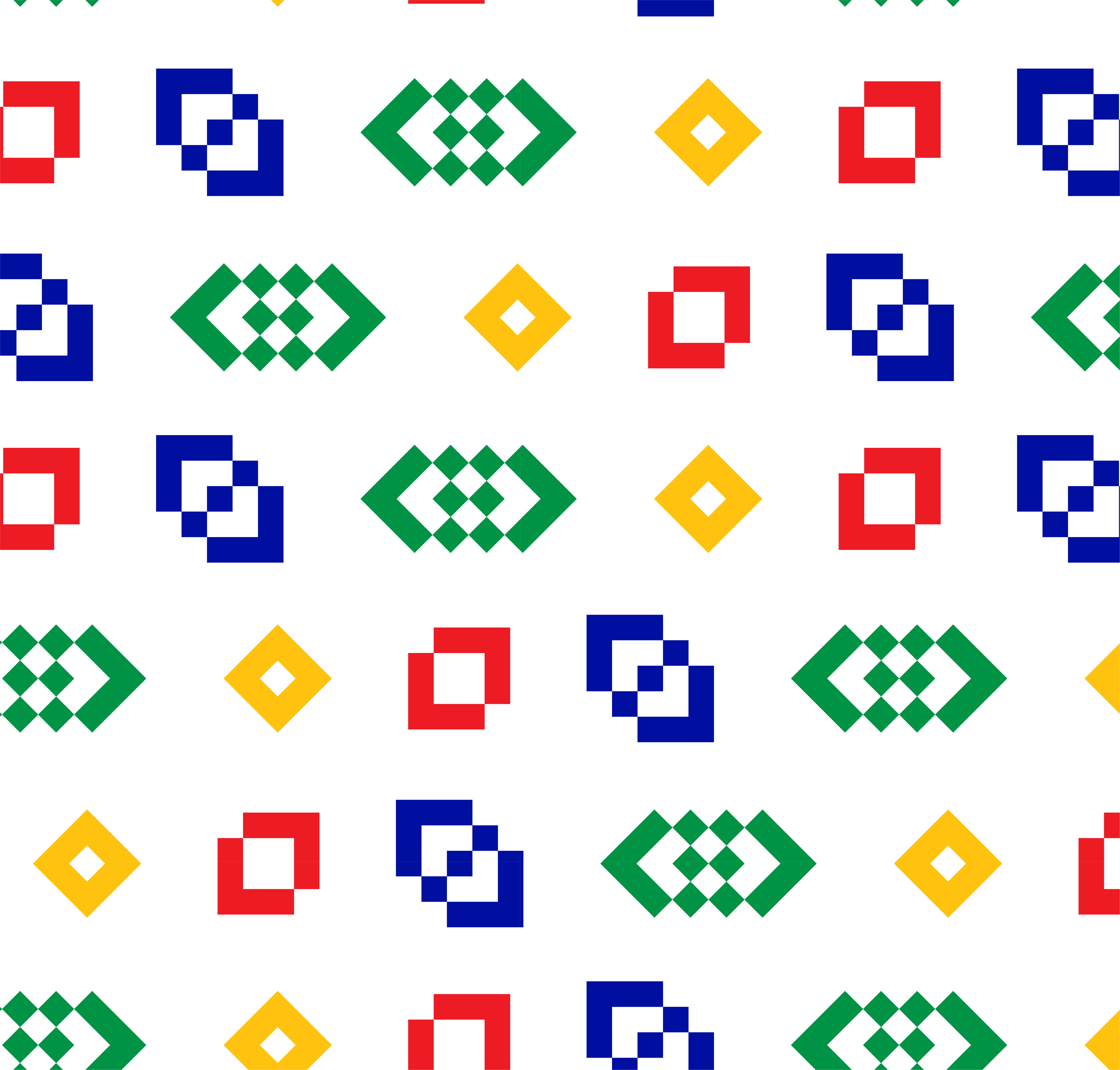
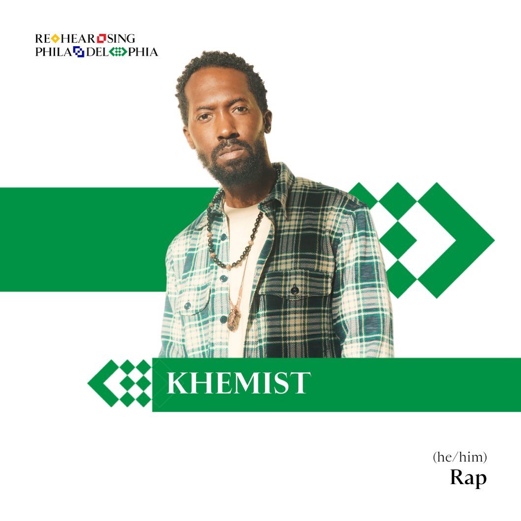
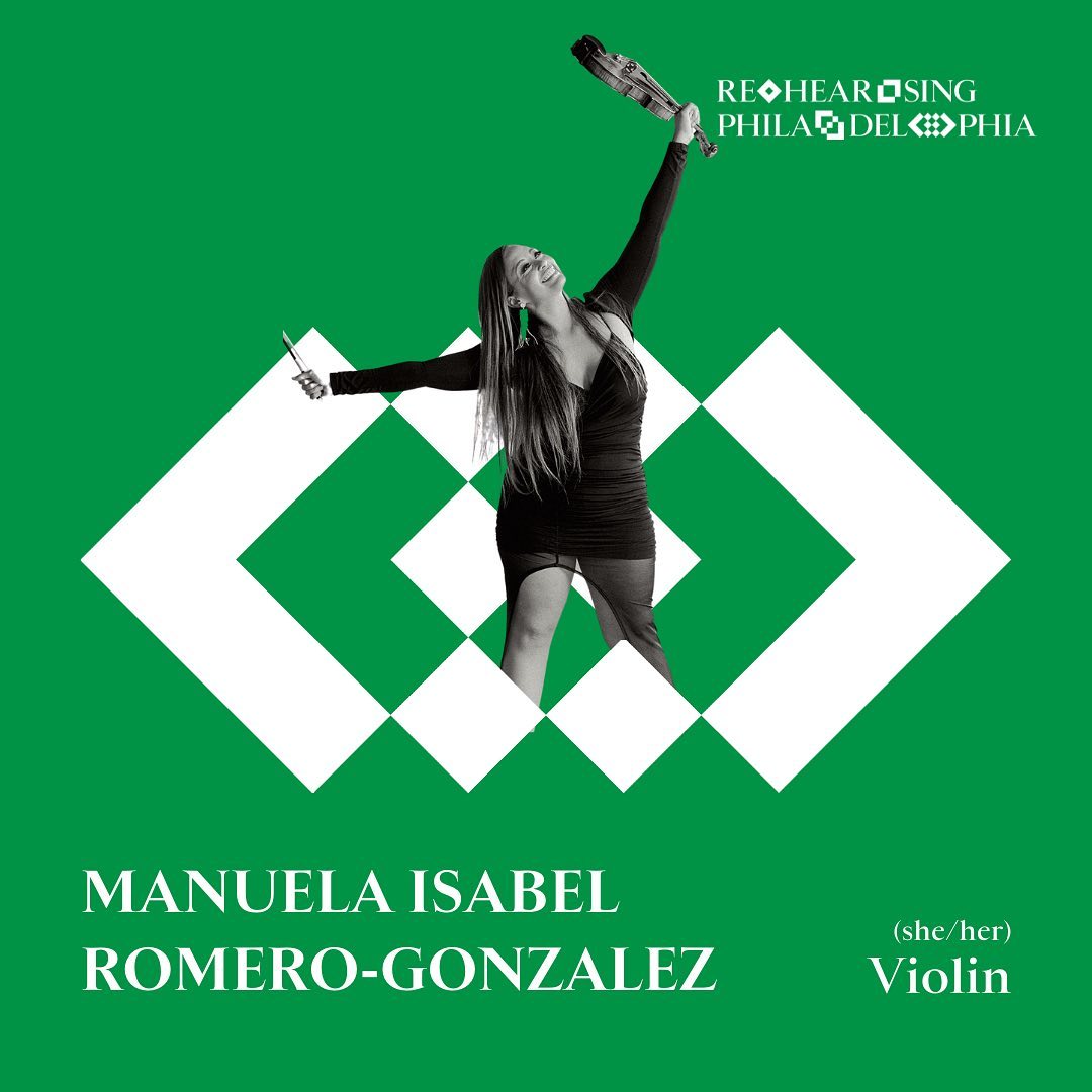
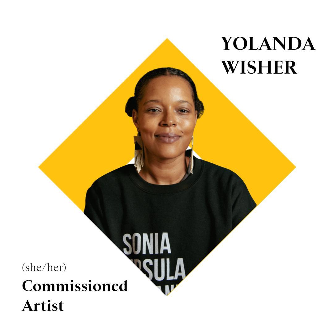
The Rehearsing Philadelphia brand identity directly captures the spirit of the city itself, refracted through the intervention of the project. The symbols system at the core of the brand serves to incite Philadelphians’ curiosity, and builds a language around the project where any one of the symbols can signal to a passerby that there is music to be found. The bareness of the graphic language is based in the idea of process, where there’s simply the work, which does not need to be overthought or over fussed with. The symbols can conjure any manner of imaginations, and when scaled, repeated, and stacked, pose an infinite number of potential outcomes, much like how one might encounter an infinite number of outcomes walking around the city of Philadelphia.


The symbols are the centerpiece of the Rehearsing Philadelphia brand. Everything is built around them, from the color palette, to the application system, to the typography. The symbol system starts with a single square, representing a single performer. The square evokes both the four modules, but also the grid system that dictates so many of Philadelphia’s streets. With that first shape as Solo, the other symbols simply take that first shape and repeat it, first with 2 (Duet), then 3 (Ensemble), and finally 4 (Orchestra).

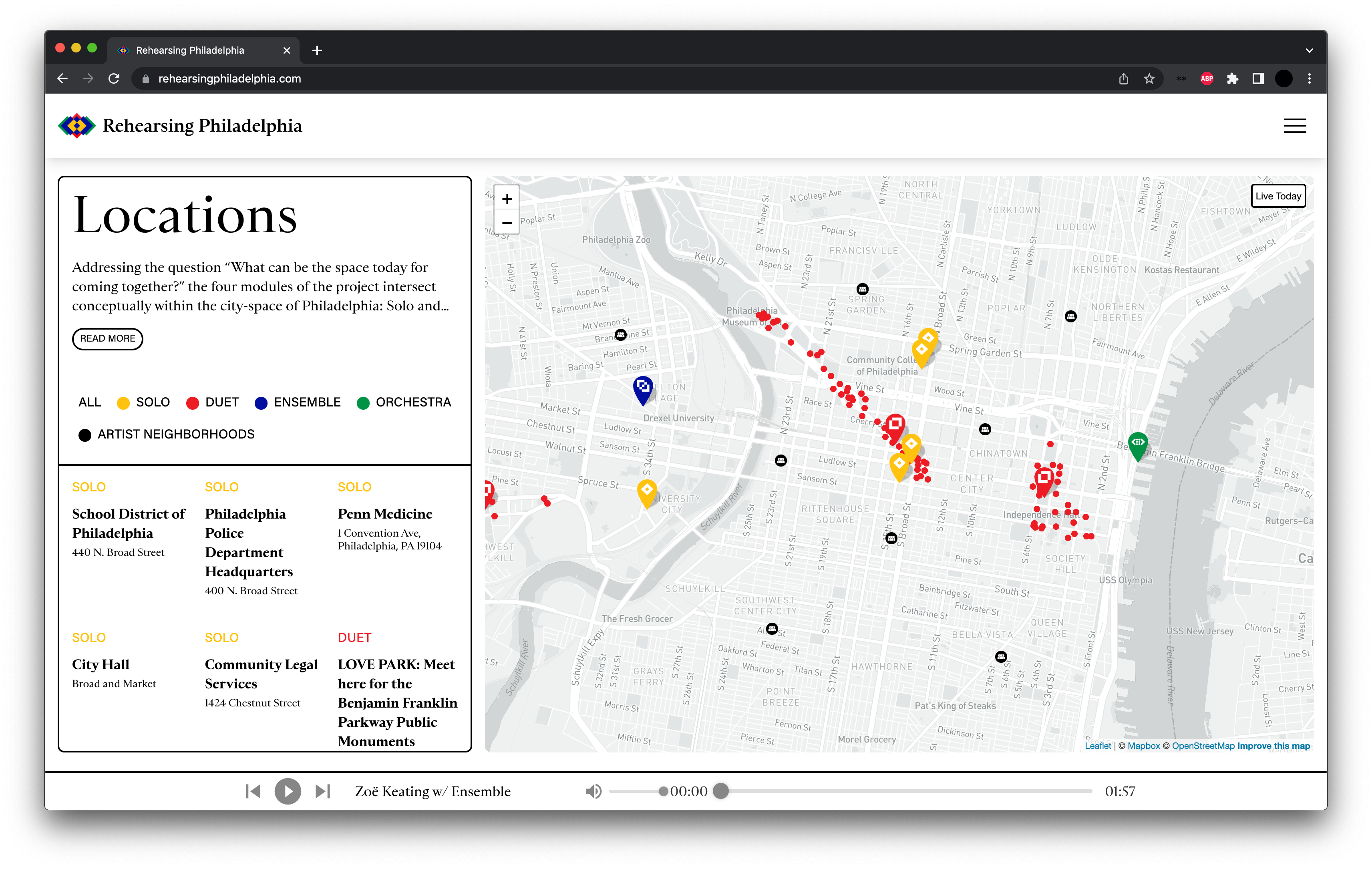


Press
The Philadelphia Inquirer
This citywide public art project asks, ‘Won’t you sing with a stranger?’
WXPN
Rehearsing Philadelphia brings progressive and experimental concerts to public spaces across the city
CREDITS
Creative Director: Van NewmanAri Benjamin Meyers
Drexel University
Curtis Institute
Type: Production Type (Saint Colombe)
Photographer: Conrad Erb
Web Design: Bryan Washington
Photographer: Conrad Erb
Web Design: Bryan Washington
DISCIPLINES
Brand Design
Brand Design