GQ Snapchat Discover
2017—2018
Starting in January 2017 I worked alongside GQ’s Digital Art Director, Meg Vazquez, to develop a completely new, mobile-first visual language for GQ’s existing brand. Getting GQ’s Snapchat Discover channel up and running meant developing an editorial strategy, focusing on accessibility and legibility, crafting a new version of the brand through movement, motion, sound design.
Snapchat Discover is the editorial arm of the core Snapchat app, where publishers and influencers can connect directly with a wide-range of audiences. GQ’s Snapchat Discover sits firmly between print and web, allowing my team to add app-specific elements such as variable typography and video, all under a narrative story arc, to GQ’s award-winning design language. For GQ, Snapchat Discover became a place for my team to explore and experiment both in design and storytelling while reaching a new audience for the magazine.
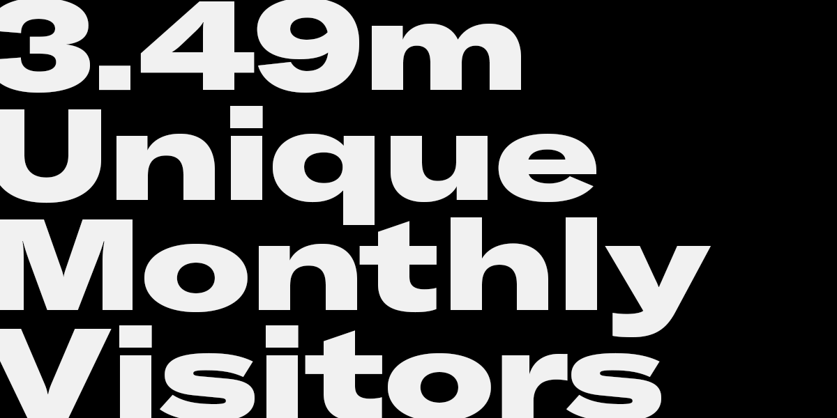
By the end of the Snapchat Discover project, we had created 153 editions and accumulated over 164 million minutes spent on our content, with almost a billion unique topsnaps viewed. While building and cultivating a new audience, we also established lasting design standards across all social and video platforms that continue to remain in use.
DESIGN
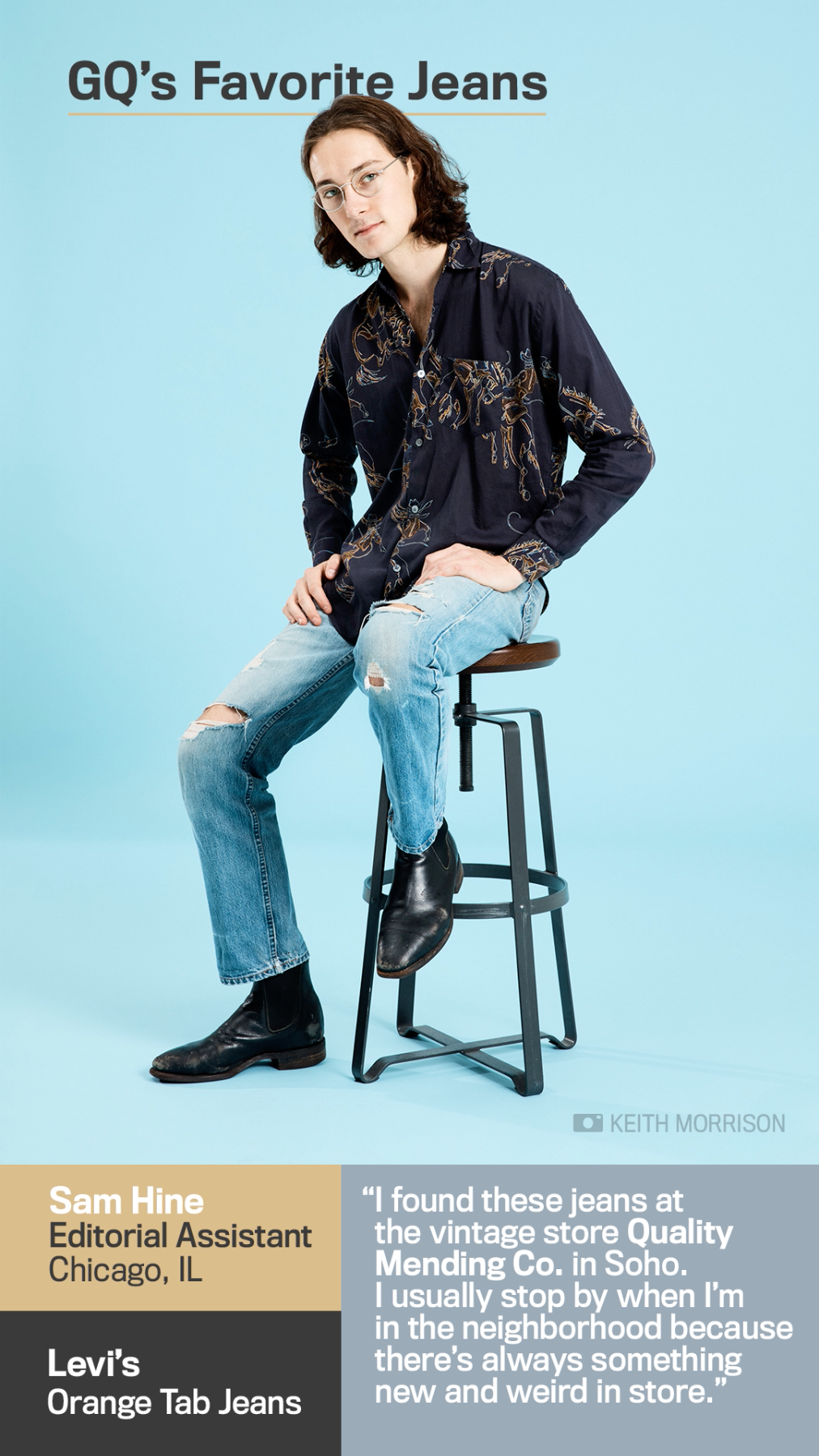
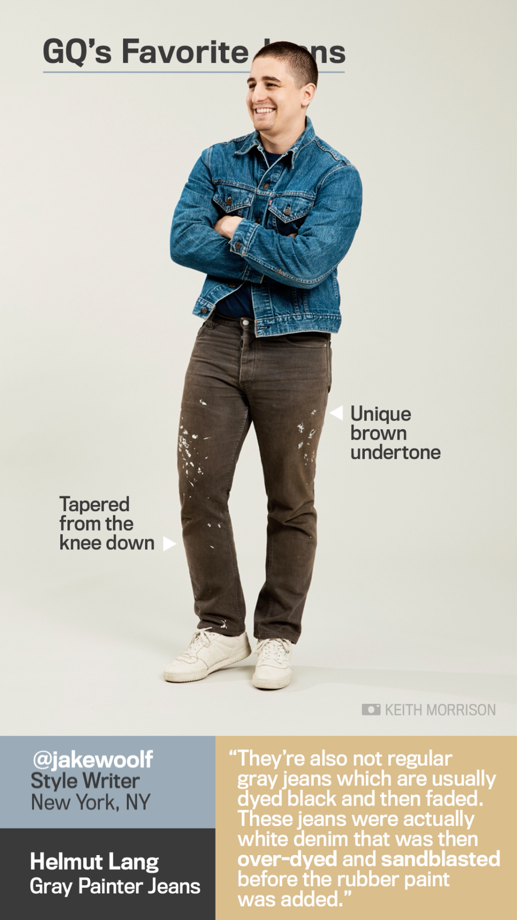
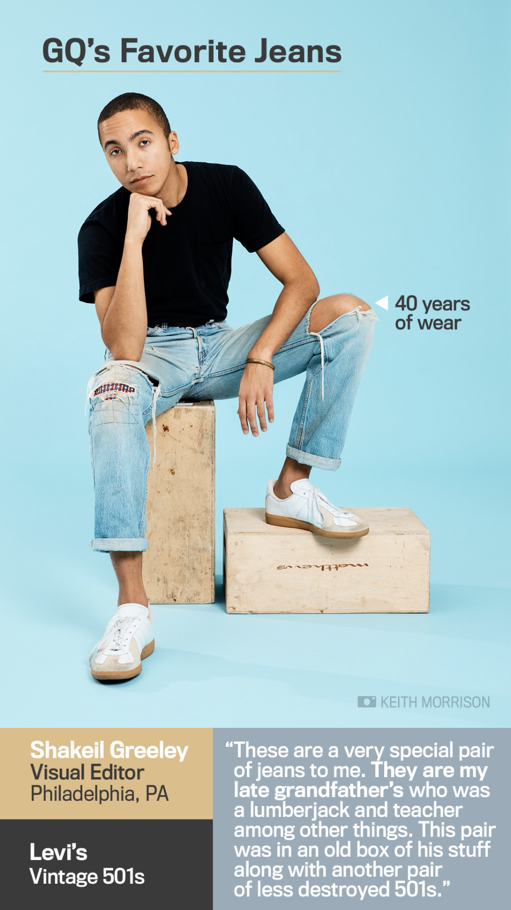
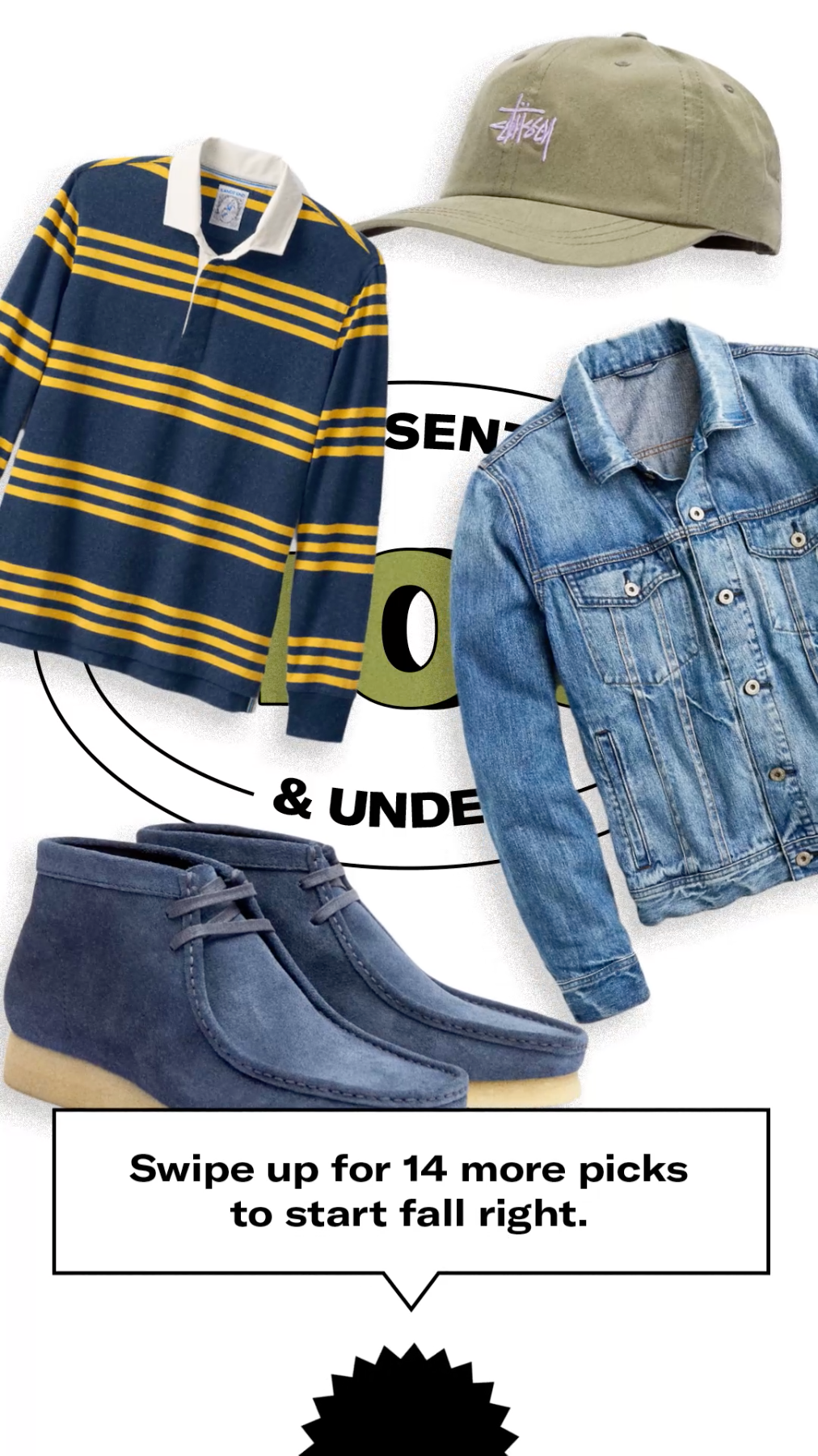
Step one in developing a visual brand for Snapchat Discover was taking a close look at print design practices and distilling down years of work into core digital elements. GQ, under then-direction of Fred Woodward, was unique in that each issue has its own world and visual language. We decided that our core elements would lean on typography but not color palette. Our constant from edition to edition was the typographic use of A2, Titling, and Signpainter. Each edition had its own palette sourced from unique visual assets, including photography, video, and illustration.
Working within a mobile-only design framework, we built out highly specific guidelines, using a grid, around type usage to ensure maximum impact and maximum legibility. Operating within this small but consistent canvas allowed us to continuously iterate and improve upon our use of the limited time (10 seconds per design) and space available. Over the course of the project, my team came to maximize every millisecond at our disposal, with every corner of the canvas activated in some way.
To coincide with GQ’s most recent redesign under Creative Director Rob Vargas, we adopted GT America as our core typeface in July 2017. Taking note from the new design ideology in print, we also updated our design practice. We shed our edition-based color palettes instead opting for a palette of black and white, with tonal accents, to allow photography and video to stand out. Our goal was to always maintain nimble enough brand guidelines that we can experiment and grow as the rest of the brand evolves.
EDITORIAL
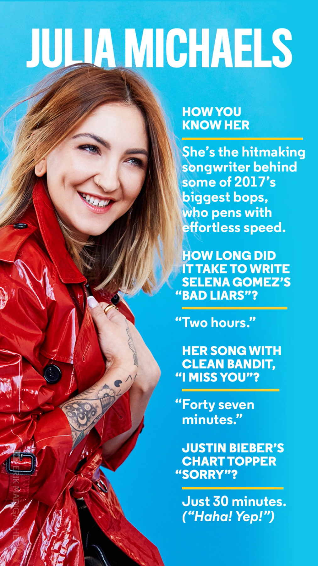
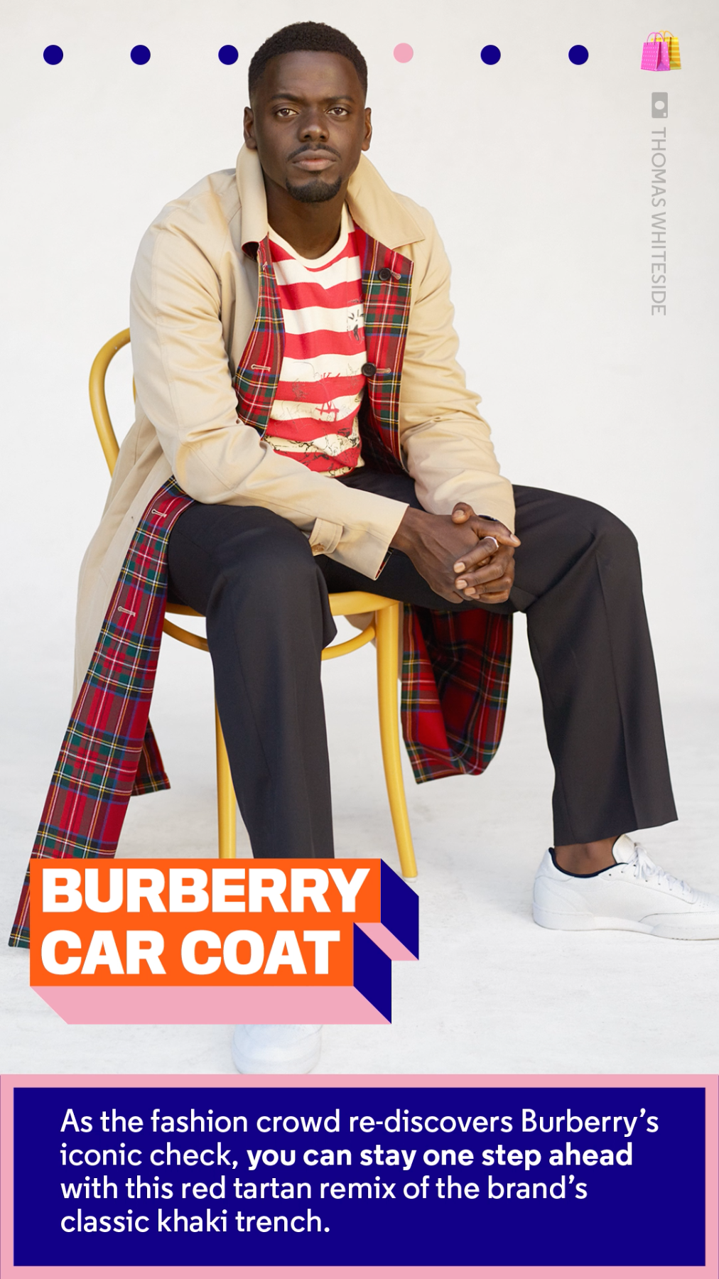
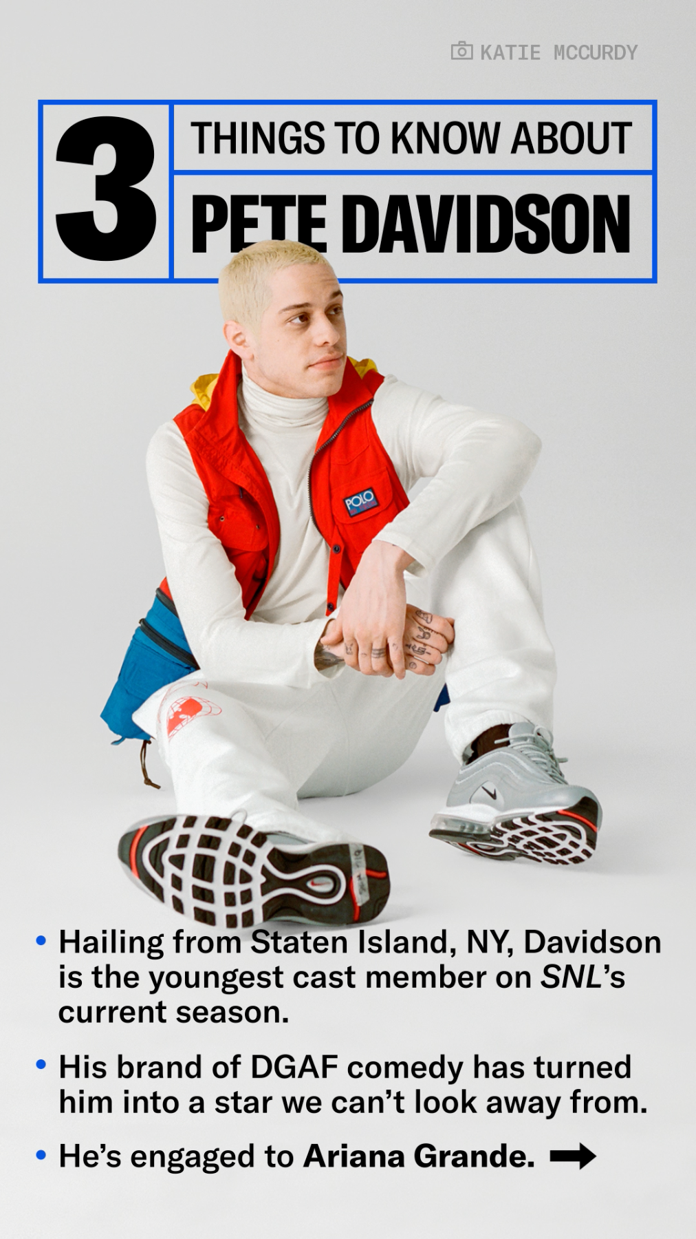
At launch in April 2017, we started publishing one edition per week with a small but collaborative team. Our team quickly grew as we moved to publishing two editions per week in July 2017. In addition to design and motion production, we were also in charge of editorial planning. I was the content planning lead, researching and pulling from all areas of GQ to create a mix of content that was suited to our new, unique audience. We covered everything from fitness, to mental health, to celebrity style, to music, using video, motion graphics, and tight, efficient editing. Every edition was sequenced in a way that told a coherent story while convincing the user to watch the edition until the end.


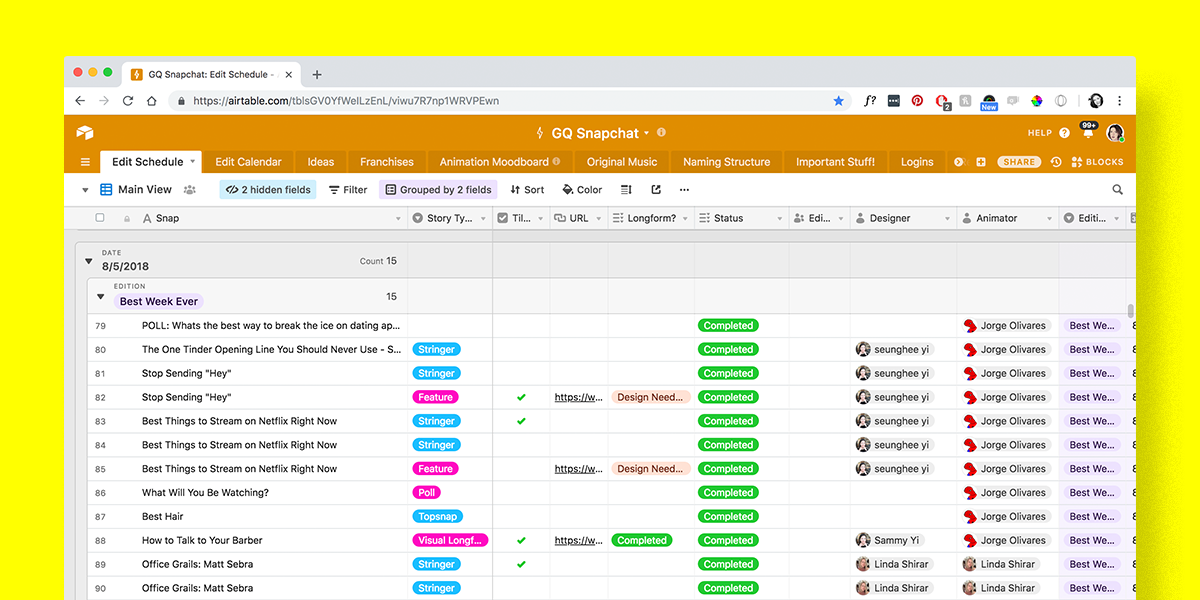
An inside look at our AirTable planning document, which we used to manage workflows and deadlines.
MOTION
Motion graphics are an integral component of Snapchat Discover, and my team created extensive motion guidelines to ensure brand consistency edition-to-edition. Our animation was always bold and authoritative, consistently slick and cool, and never soft or unsure of itself.
MUSIC
In addition to being the content lead for the platform, I also worked closely with musicians to create a unique, brand-specific music library. All of the music you hear on this page is original to GQ’s brand.
VIDEO
Although we based our editorial output on the magazine and the website, my team also created a number of original videos and photoshoots that were for Snapchat first. Some highlights include “Mall Denim with Matt Cutshall,” “History of Reggae with Chronixx,” “History of AF1’s with Fabolous,” “GQ Fitness Guides,” and “GQ Office Style.”


CREDITS
Digital Art Director: Meg VazquezLead Motion Designer: Linda Shirar
Motion Designer: Jorge Olivares
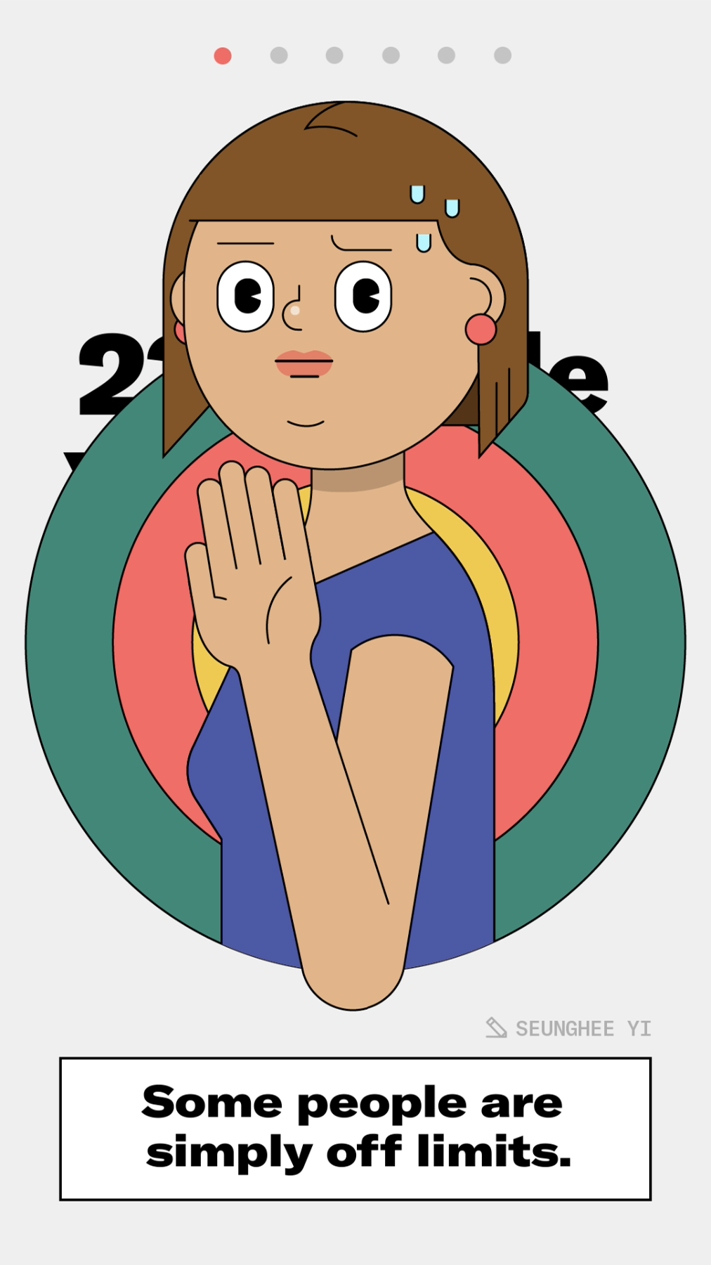
Design + Illustration: Seunghee Yi
Visual Producer: Camila Perez
DISCIPLINES
Art Direction
Design
Editorial Planning
Team Management
Art Direction
Design
Editorial Planning
Team Management